Sun, April 25, 2010, 05:56 PM under
AboutPresenting
PowerPoint is a great tool for conference (large audience) presentations, which is the context for the advice below.
The #1 thing to keep in mind when you create slides (at least for conference sessions), is that they are there to help you remember what you were going to say (the flow and key messages) and for the audience to get a visual reminder of the key points. Slides are not there for the audience to read what you are going to say anyway. If they were, what is the point of you being there? Slides are not holders for complete sentences (unless you are quoting) – use Microsoft Word for that purpose either as a physical handout or as a URL link that you share with the audience. When you dry run your presentation, if you find yourself reading the bullets on your slide, you have missed the point. You have a message to deliver that can be done regardless of your slides – remember that. The focus of your audience should be on you, not the screen.
Based on that premise, I have created a checklist that I go over before I start a new deck and also once I think my slides are ready.
- Turn AutoFit OFF. I cannot stress this enough.
- For each slide, explicitly pick a slide layout. In my presentations, I only use one Title Slide, Section Header per demo slide, and for the rest of my slides one of the three: Title and Content, Title Only, Blank. Most people that are newbies to PowerPoint, get whatever default layout the New Slide creates for them and then start deleting and adding placeholders to that. You can do better than that (and you'll be glad you did if you also follow item #11 below).
- Every slide must have an image.
- Remove all punctuation (e.g. periods, commas) other than exclamation points and question marks (! ?).
- Don't use color or other formatting (e.g. italics, bold) for text on the slide.
- Check your animations. Avoid animations that hide elements that were on the slide (instead use a new slide and transition). Ensure that animations that bring new elements in, bring them into white space instead of over other existing elements. A good test is to print the slide and see that it still makes sense even without the animation.
- Print the deck in black and white choosing the "6 slides per page" option. Can I still read each slide without losing any information? If the answer is "no", go back and fix the slides so the answer becomes "yes".
- Don't have more than 3 bullet levels/indents. In other words: you type some text on the slide, hit 'Enter', hit 'Tab', type some more text and repeat at most one final time that sequence. Ideally your outer bullets have only level of sub-bullets (i.e. one level of indentation beneath them).
- Don't have more than 3-5 outer bullets per slide. Space them evenly horizontally, e.g. with blank lines in between.
- Don't wrap. For each bullet on all slides check: does the text for that bullet wrap to a second line? If it does, change the wording so it doesn't. Or create a terser bullet and make the original long text a sub-bullet of that one (thus decreasing the font size, but still being consistent) and have no wrapping.
- Use the same consistent fonts (i.e. Font Face, Font Size etc) throughout the deck for each level of bullet. In other words, don't deviate form the PowerPoint template you chose (or that was chosen for you). Go on each slide and hit 'Reset'. 'Reset' is a button on the 'Home' tab of the ribbon or you can find the 'Reset Slide' menu when you right click on a slide on the left 'Slides' list. If your slides can survive doing that without you "fixing" things after the Reset action, you are golden!
- For each slide ask yourself: if I had to replace this slide with a single sentence that conveys the key message, what would that sentence be? This exercise leads you to merge slides (where the key message is split) or split a slide into many, if there were too many key messages on the slide in the first place. It can also lead you to redesign a slide so the text on it really is just explanation or evidence for the key message you are trying to convey.
- Get the length right. Is the length of this deck suitable for the time you have been given to present? If not, cut content! It is far better to deliver less in a relaxed, polished engaging, memorable way than to deliver in great haste more content. As a rule of thumb, multiply 2 minutes by the number of slides you have, add the time you need for each demo and check if that add to more than the time you have allotted. If it does, start cutting content – we've all been there and it has to be done.
As always, rules and guidelines are there to be bent and even broken some times. Start with the above and on a slide-by-slide basis decide which rules you want to bend. That is smarter than throwing all the rules out from the start, right?
Sun, April 25, 2010, 05:54 PM under
AboutPresenting
Once a feature has shipped, it is very hard to eliminate it from the next release. If I was in charge of the PowerPoint product, I would not hesitate for a second to remove the dreadful AutoFit feature.

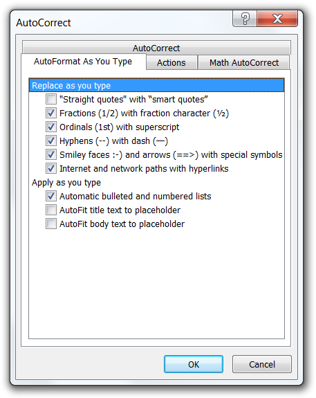
Fortunately, AutoFit can be turned off on a slide-by-slide basis and, even better, globally: go to the PowerPoint "Options" and under "Proofing" find the "AutoCorrect Options…" button which brings up the dialog where you need to uncheck the last two checkboxes (see the screenshot to the right).
AutoFit is the ability for the user to keep hitting the Enter key as they type more and more text into a slide and it magically still fits, by shrinking the space between the lines and then the text font size. It is the root of all slide evil. It encourages people to think of a slide as a Word document (which may be your goal, if you are presenting to execs in Microsoft, but that is a different story). AutoFit is the reason you fall asleep in presentations.
AutoFit causes too much text to appear on a slide which by extension causes the following:
- When the slide appears, the text is so small so it is not readable by everyone in the audience. They dismiss the presenter as someone who does not care for them and then they stop paying attention.
- If the text is readable, but it is too much (hence the AutoFit feature kicked in when the slide was authored), the audience is busy reading the slide and not paying attention to the presenter. Humans can either listen well or read well at the same time, so when they are done reading they now feel that they missed whatever the speaker was saying. So they "switch off" for the rest of the slide until the next slide kicks in, which is the natural point for them to pick up paying attention again.
- Every slide ends up with different sized text. The less visual consistency between slides, the more your presentation feels unprofessional. You can do better than dismiss the (subconscious) negative effect a deck with inconsistent slides has on an audience.
In contrast, the absence of AutoFit
- Leads to consistency among all slides in a deck with regards to amount of text and size of said text.
- Ensures the text is readable by everyone in the audience (presuming the PowerPoint template is designed for the room where the presentation is delivered).
- Encourages the presenter to create slides with the minimum necessary text to help the audience understand the basic structure, flow, and key points of the presentation. The "meat" of the presentation is delivered verbally by the presenter themselves, which is why they are in the room in the first place.
- Following on from the previous point, the audience can at a quick glance consume the text on the slide when it appears and then concentrate entirely on the presenter and what they have to say.
You could argue that everything above has nothing to do with the AutoFit feature and all to do with the advice to keep slide content short. You would be right, but the on-by-default AutoFit feature is the one that stops most people from seeing and embracing that truth.
In other words, the slides are the tool that aids the presenter in delivering their message, instead of the presenter being the tool that advances the slides which hold the message. To get there, embrace terse slides: the first step is to turn off this horrible feature (that was probably introduced due to the misuse of this tool within Microsoft). The next steps are described on my next post.
Sun, April 25, 2010, 02:18 PM under
Random
Office 2010 has reached RTM.
Here are my favorite Outlook features.
- Speed. It is faster than previous versions and hangs much less…
- Ignore Conversation (Ctrl+Del). Not interested in a conversation? Click this button on the new ribbon and you'll never receive another message on that thread (they all go to your Deleted folder).
- Calendar Preview. When receiving a Meeting Request, before deciding to accept or not you get to see a preview of your calendar for that day and where the new meeting would fit in. See full description on outlook team blog post.
- Quick Steps. See full description on outlook team blog post. I have created my own quick steps for filing conversations to folders, various pre-populated reply templates, creating calendar invites and creating TODOs from received emails.
- Search Interface. Many of us knew the magic keywords for making smart searches (e.g. from:Name), but it is great to learn many more through the search tools contextual ribbon tab.
- Next 7 days. Out of the many enhancements to the Calendar view, my favorite is to be able with single click to view the next 7 days – that is now my default view.
- MailTips. See full description on outlook team blog post. The ones I particularly like are
- when composing a mail to someone that has their Out Of Office reply set, you get to read it before sending the mail (and hence can decide to postpone sending).
- when composing a mail to a distribution list, a message informs you of the number of recipients. Hopefully, senders will use that as a clue for narrowing down the recipient list or at least verifying that their mail should indeed be sent to so many people.
- "You are not responding to the latest message in this conversation. Click here to open it.". When composing a reply to a conversation and you have not picked the last message to reply to (don't you hate it when people split threads like that?), this is the inline message you see (under the MailTips area) and if you click on the message it opens the last mail in the conversation so you can reply to that.
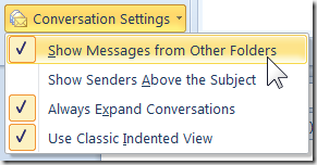
- Rich "Conversation Settings" and in particular "Show Messages from Other Folders".
 For example, you can see in your inbox not only the message you received but also the reply you sent (it gets pulled in from the Sent folder). Another example: a conversation has been taking place on a distribution list (so your rules filed it to a folder) and they add you on the TO or CC line, so it appears in a different folder; regardless of which folder you open, you are able to see the entire conversation. Note that messages from other folders than the one you are browsing, appear in grey text so you can easily spot them. Reading them in one folder, obviously marks them as read in the other folder…
If you haven't yet, when are you making the move to Outlook 2010?
Sun, April 25, 2010, 02:12 PM under
Random
I have been using Office 2010 since Beta1 and have not looked back since. I am currently on an internal RC, but will upgrade tomorrow to the RTM version.

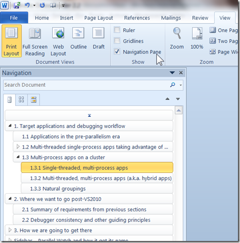
There are a plethora of new productivity features and for Word 2010 the one that overshadows everything else, IMO, is the Navigation Pane. I could spend time describing it here, but I'll never be able to cover it more thoroughly than what the product team has on their blog post.
You enable it via the "Navigation Pane" checkbox in the "Show" group of the "View" tab on the Word ribbon.
Even if you have come across this new Word 2010 feature, trust me you will learn something more about it, you will thank me later. Go learn how to make the most of the new Navigation Pane.
As an aside, there are many new benefits in PowerPoint 2010 too, my favorite being support for sections. Not to leave Excel 2010 out, you should check Excel's integration with HPC Server.