Thu, October 22, 2009, 08:22 PM under
ParallelComputing
When we developed the
Parallel Debugging windows, we had to choose their default
position in Visual Studio. For Parallel Tasks it was easy: we chose wherever the Threads window appears by default, since the two windows share characteristics in usage and appearance. Parallel Stacks may be similar to the basic concept of the Call Stack window, but it has slightly different usage patterns and very different UI. Here I'll describe our rational for the current choice for the Parallel Stacks window, offering tips and request feedback.
It was more challenging that just picking a position at random, especially due to the window having high screen real estate demands for typical applications – after all, it is a graphical view of all the call stacks of all the threads/tasks in your application. So, we quickly dismissed having it docked at the bottom or top since those are typically narrow in height windows. Some of us believed that the document editor area would be a good place for it since it has more screen real estate to offer. That approach breaks down when you realize that the Parallel Stacks window is not just presenting data, but it also allows you to quickly switch to any stack frame of any thread (with a double click). When that user action takes place, the code editor navigates to the method context and thus steals the focus from the Parallel Stacks window which gets pushed to the back (this also happens when you simply toggle the "Show External Code" option). So if you want to navigate to various places in the code via a series of examinations, that position quickly becomes irritating (just like if you docked Solution Explorer in the code editor area).
So we decided the default position to be floating! The idea is that you can resize it based on your preferences and move it in and out of the way if necessary: you get to see as much of it as you want and you keep it on top of other windows (typically to the right side). The real expectation is that you will
drag the floating window to your second monitor and maximize it there.
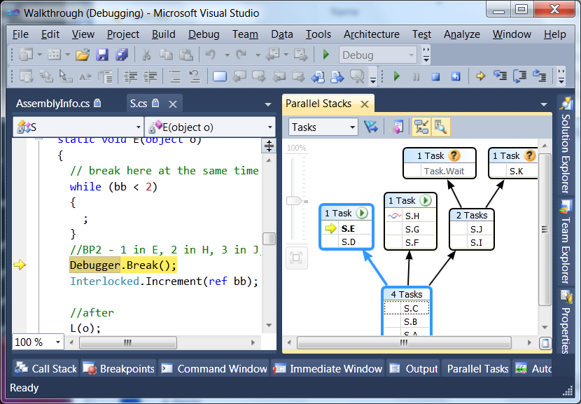
Two other options came close to be chosen and I'll offer them here as tips in case they suit you better (in particular if you don't have a second monitor or when debugging on the go on your laptop). One is to dock it within the document editor, but in a New Vertical Tab Group. This way it takes up the space it typically needs, while keeping your code editor in view when you switch stack frames.

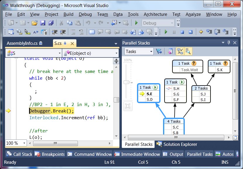
The other option is to dock the Parallel Stacks window where the Solution Explorer window lives. That way you can resize that group of windows horizontally to see more content (and use for navigation) without taking too much away from your code view (assuming your lines of code are not extremely long). When you are done using it, you can quickly resize it back to normal.

It is amazing how much thought/discussion goes into, what many people would consider, an insignificant detail, but that is the kind of thing I enjoy, which I guess is why I do what I do. In any case, I am eager to hear how we got this decision wrong, so please let me know.