Sun, January 18, 2009, 11:54 AM under
AboutPresenting
I have given quite a few technical presentations in my time and anyone that has attended one will tell you that I believe in demo-driven sessions (I have *never* given a session that had less than 50% demo time and most of them met my goal to be close to 75%+). Having said that, the few slides that a session has are important and what is equally important in my opinion is to strive for
an image per slide!
If you can't find an image that conveys the message of the slide, then maybe your slide is trying to convey too much; if the image does not fit on your slide, then maybe your slide is too busy; if you can't tie an image to the message, then maybe you can insert some humorous image. So, I think of it as a quality gate for my slide: if I can’t insert an image, there is something wrong with the slide. If you don’t agree with that, then still insert an image in order to please the people that think more visually than others and also to add some color to your deck ;-)
After you have inserted an image, please use the tools offered by PowerPoint to make it aesthetically pleasing. When you select the image, a new tab appears in the PowerPoint 2007 ribbon with tons of options -
explore them:

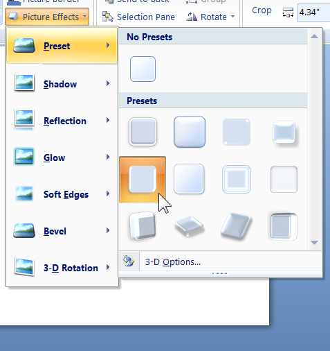
It is surprising how many times people ask me how I created a glow effect or a reflection (aka mirroring) effect etc. Depending on your personal preferences and the theme of your deck, some options work better than others, but by far my favorite and the one I start with as a default is preset 5:

Please try it now on a slide: insert an image twice and apply the preset on one and leave the other "plain/default". Can you see the difference in quality? Try it projected on a huge screen and you'll never go back…
There you have it! I shared the secret to the images in my decks ("big deal" I know, but oddly it took me some time to be comfortable sharing this nonetheless ;-)